
When a visitor lands on your website, you have roughly 3 to 5 seconds to convince them to stay. That decision happens in a single space: the above the fold content area. Get it right and conversions climb. Get it wrong and your bounce rate tells the story.
At Zach’s Web Designs, we have redesigned hundreds of hero sections, and the rules have shifted considerably as scrolling behavior has matured. This guide breaks down what to put above the fold, what to leave out, and how the concept has evolved in 2026.
What Does Above the Fold Content Actually Mean?
Above the fold content is the portion of a webpage that is visible to a user without scrolling. The term is borrowed from print newspapers, where the most important headlines were placed on the top half of the front page, visible above the physical fold.
On the web, the “fold” is not a fixed line. It changes depending on:
- Screen size and resolution
- Device type (mobile, tablet, desktop, ultrawide)
- Browser chrome and toolbars
- Operating system
For practical design purposes in 2026, most teams target a viewport of around 1366×768 on desktop and 390×844 on mobile as their reference fold.
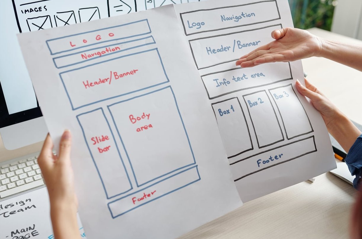
Why Above the Fold Still Matters in 2026
You may have read forum debates claiming the fold is dead because users now scroll naturally. That is a half truth. Yes, users scroll, but research consistently shows that users still spend about 57% of their viewing time above the fold, and only a fraction of visitors reach the bottom of a page.
The fold is not about cramming everything into one screen. It is about earning the scroll. If your hero section does not communicate value quickly, the rest of your page will never be seen.
What to Put Above the Fold
Here are the essential elements that belong in the first viewport, ranked by priority.
1. A Clear Value Proposition
Your headline should answer three questions in one glance:
- What do you offer?
- Who is it for?
- Why should they care?
Avoid clever wordplay that requires interpretation. “Custom WordPress sites for service businesses that want more leads” beats “We craft digital experiences” every time.
2. A Supporting Subheadline
Use one or two lines below your main headline to add context, mention a key benefit, or address a common objection. This is where you turn curiosity into intent.
3. A Primary Call to Action (CTA)
One visually dominant CTA belongs above the fold. It should:
- Use action oriented language (“Get my free quote”, “Start your trial”)
- Contrast strongly with the background
- Sit close to the value proposition, not isolated in a corner
A secondary CTA (like “See how it works”) can sit nearby, but it should be visually quieter.
4. A Hero Visual
An image, illustration, video, or product screenshot that supports the message. The visual should reinforce your value proposition, not decorate around it. Generic stock photos of people shaking hands hurt more than they help.
5. Trust Signals
Subtle but powerful. Examples include:
- Client logos (“Trusted by”)
- Star ratings or review counts
- Certifications or awards
- User counts (“Used by 12,000+ teams”)
6. Clean, Functional Navigation
Your menu should be easy to scan, with a logical structure. Sticky headers are now standard practice, but they should be slim enough not to crowd the hero on mobile.
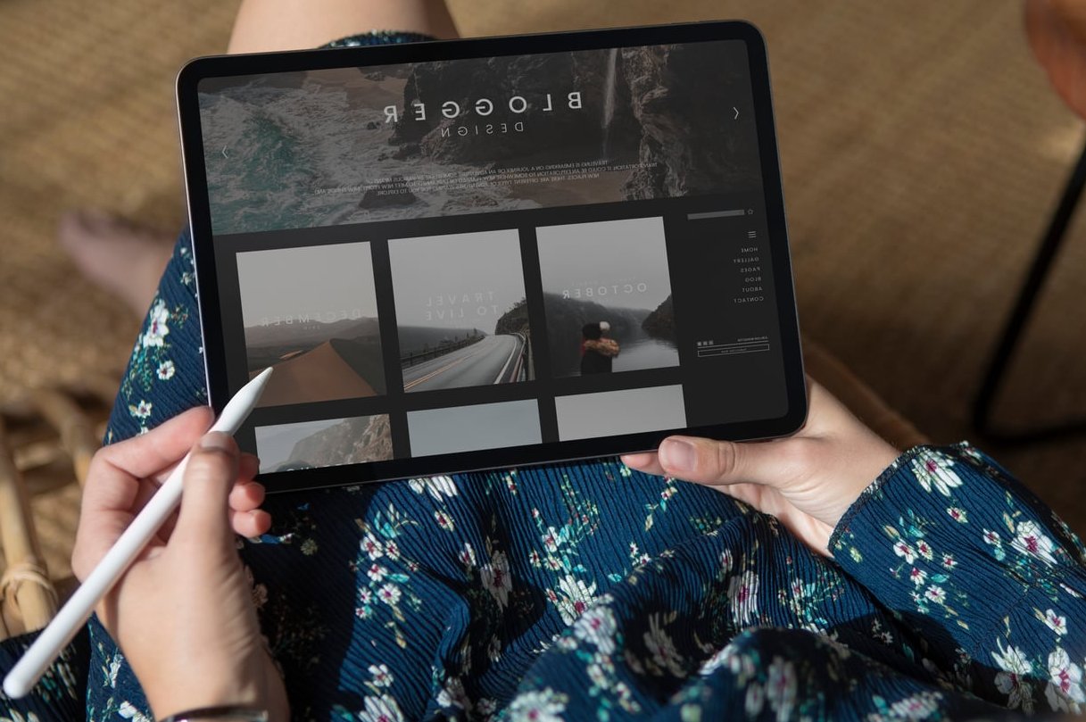
Above the Fold Layout Patterns That Work
Below are proven layouts you can adapt to your own site.
| Pattern | Best For | Key Strength |
|---|---|---|
| Split Hero (text left, visual right) | SaaS, agencies, B2B | Balanced focus on copy and product |
| Centered Hero (text over background) | Brand led sites, portfolios | Strong emotional impact |
| Video Background Hero | Restaurants, travel, lifestyle | Immersive storytelling |
| Form First Hero | Lead generation, quote tools | Reduces steps to conversion |
| Search First Hero | Marketplaces, directories | Matches user intent instantly |
What to Avoid Above the Fold
The wrong elements in your hero section can sink conversions just as fast as the right ones can lift them.
- Auto playing carousels. Users rarely interact with slide 2, 3, or 4. Pick one message and commit to it.
- Pop ups that fire instantly. Let visitors see your value first. Delay or scroll trigger your modals.
- Vague headlines. “Welcome to our website” or “Innovative solutions” tell visitors nothing.
- Multiple competing CTAs. Three buttons of equal weight create decision paralysis.
- Heavy hero images that slow load times. A beautiful image that takes 4 seconds to render is a liability for both UX and Core Web Vitals.
- Dense paragraphs. The fold is for hooks, not essays.
- Cookie banners that cover the CTA. Design around your consent banner, not in spite of it.

How the Concept Has Evolved
The above the fold conversation has changed dramatically over the last decade.
From rigid line to fluid zone
In the early 2010s, designers obsessed over a fixed pixel line, usually 600 pixels down. With responsive design and an explosion of device sizes, the fold became a zone rather than a line. Today we design for the first viewport on each major breakpoint, not a single magic number.
Scrolling is now expected
Mobile users scroll instinctively. Long form pages, infinite feeds, and TikTok style scrolling have rewired user behavior. The fold is no longer a wall, it is a handshake. Its job is to confirm “yes, you are in the right place” so the user keeps going.
Core Web Vitals raised the stakes
Google’s Largest Contentful Paint (LCP) metric specifically measures how fast the largest above the fold element loads. A slow hero hurts both SEO and conversions. Optimize images with modern formats like AVIF, lazy load anything below the fold, and avoid render blocking scripts.
Personalization is moving above the fold
Modern sites increasingly personalize the hero based on traffic source, location, or returning visitor status. A returning customer might see “Welcome back, ready to reorder?” while a first time visitor sees the standard value proposition.
A Quick Above the Fold Audit Checklist
Run your homepage through this list:
- Can a stranger explain what you do in 5 seconds?
- Is there exactly one primary CTA?
- Does the hero load in under 2.5 seconds (LCP)?
- Does it look balanced on a 390 pixel wide phone?
- Are at least one or two trust signals visible?
- Have you tested it without auto playing media?
- Is the cookie banner working with the design, not against it?
FAQ
Is above the fold content still relevant in 2026?
Yes. While users scroll more than ever, attention is still concentrated in the first viewport. The fold determines whether visitors stay long enough to scroll at all.
How tall should the above the fold section be?
Design for roughly 768 pixels of vertical space on desktop and around 800 pixels on mobile. Avoid forcing users to see a full screen hero with no hint of content below, since that discourages scrolling.
Should I put a form above the fold?
Yes if your primary goal is lead capture and the form is short (3 fields or fewer). For longer forms, use a CTA button above the fold that links to or expands the full form.
Does above the fold content affect SEO?
Indirectly but strongly. Google’s Core Web Vitals, especially Largest Contentful Paint, measure the speed and stability of above the fold elements. Quality content above the fold also reduces bounce rate, which improves engagement signals.
What is the difference between the hero section and above the fold?
The hero section is the dedicated top block of a page (headline, visual, CTA). Above the fold is everything visible without scrolling, which usually includes the hero plus the navigation and sometimes the start of the next section.
Final Thoughts
Above the fold content is not about squeezing every important element into the first viewport. It is about earning attention and earning the scroll. A focused value proposition, one strong CTA, a relevant visual, and quiet trust signals will outperform a cluttered hero every time.
If you want a professional review of your current hero section, the team at Zach’s Web Designs can audit your above the fold experience and recommend improvements that move the needle. Reach out and we will take a look.